Blog

Modern Bedroom Wardrobe Color Combinations: A Project Guide

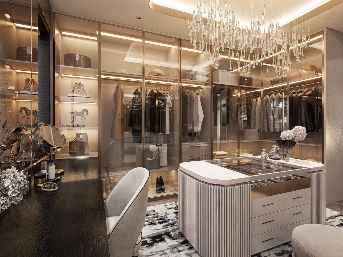
Wardrobe cabinet design smart lighting tracks.

In the pursuit of personalized spaces and premium living, mass-produced furniture often falls short of capturing the true essence of a home.

As modern minimalism and light luxury styles continue to dominate global design trends, high-end custom furniture has become the absolute core of creating an ideal living space.However, the custom furniture market can be highly complex.

Bridging the gap between a stunning design blueprint and the final product involves navigating materials, hardware, and craftsmanship. Here is how to choose bespoke luxury furniture like a professional designer.
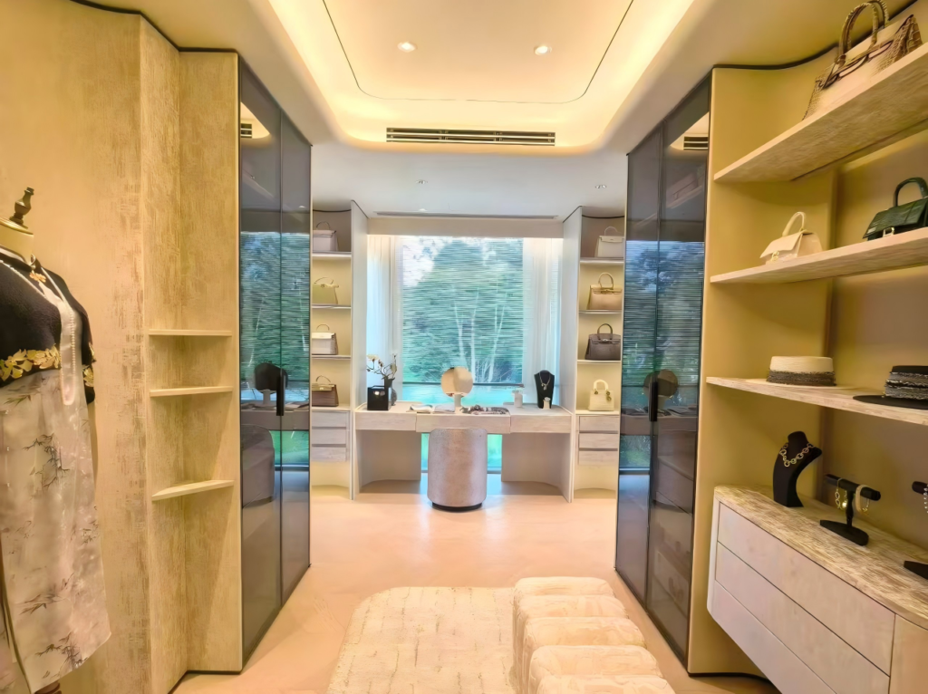
The color combination that looks perfect in a showroom under one light source can read completely differently once it's installed under a hotel room's actual lighting — and that's before accounting for finish drift across a hundred identical units. Here's what actually determines whether a wardrobe color combination holds up at project scale.

Every wardrobe color guide online is a list of pairings — white with wood, black with brass, two-tone panels — each shown in one perfectly lit photograph. That photograph tells you almost nothing about how the same combination will look once it's installed in forty identical guest rooms lit by whatever fixtures the project actually specified, or whether the finish batch that arrives in month six matches the sample that was approved in month one.

Read time — 8 min
Applies to — Lacquer, veneer & mixed-material wardrobe finishes
Scope — Villa & hotel guest room projects
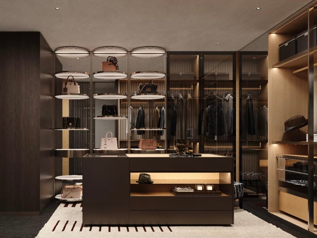
Combinations That Work — and Why

Popular wardrobe color pairings
CombinationEffectBest fit
White + warm woodBrightens the room while retaining warmthMost bedroom sizes; safe, versatile default
Black + warm woodDramatic, hotel-inspired ambience under warm lightingLarger rooms with good natural or ambient light
Two-tone (upper/lower panels)Adds dimension without full commitment to one bold shadeFeature walls, statement wardrobes
Grey + whiteCalm, modern, spatially neutralCompact rooms needing an airy feel
Mirror panel + woodReflects light, visually enlarges the roomSmall or narrow bedrooms

These pairings work consistently because they follow a simple underlying rule: light tones expand a room’s perceived size, dark tones add depth and drama but reduce perceived space, and warm wood tones soften the transition between the two rather than letting light and dark faces feel disconnected.

The Lighting Variable Almost No Wardrobe Guide Accounts For

A wardrobe color isn’t a fixed thing — it’s a fixed pigment interacting with whatever light source is actually installed in the room, and that interaction changes the color’s appearance more than most specification processes account for.

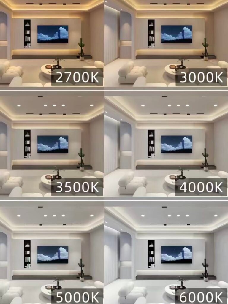
Comparison of the bedroom in different colors
  • Warm light (2700K–3000K) enriches warm wood tones and reds, making wood grain look deeper and more inviting — but slightly mutes blues, greys, and whites.
  • Neutral-to-cool light (4000K–5000K) offers more accurate, daylight-like color rendering, making whites and greys look cleaner and truer, but can make warm wood tones read flatter than they did in a showroom lit at a warmer temperature.

The showroom problem — a wardrobe combination approved under a showroom’s lighting setup will not necessarily look the same once it’s installed under the CCT actually specified for the guest room. A grey-and-white combination that felt crisp and modern under 4000K showroom lighting can look cold and flat under a hotel room’s warmer 3000K ambient lighting, and vice versa for wood tones. The combination should be approved under a lighting sample matching the project’s actual installed CCT, not the showroom’s.

Room Proportion: Where Dark Combinations Actually Work

Dark wardrobe finishes read as sophisticated in a well-lit, generously sized room, and as visually heavy in a small or dimly lit one. Before specifying a black or deep-toned wardrobe across a project, it’s worth checking room proportion and available natural or ambient light per unit type — a combination that looks premium in a villa’s primary suite can feel oppressive in a smaller secondary bedroom with the same finish applied by default.

Batch Consistency Across Multiple Units

cabinetry factory assembly line.

On a single wardrobe, color consistency is a non-issue. On a hotel with a hundred identical guest room wardrobes, or a villa development with the same finish specified across every unit, batch-to-batch color drift becomes the recurring quality risk — a lacquer or veneer tone that matches perfectly in the approved sample can shift subtly across production runs if the supplier isn’t holding tight color control.

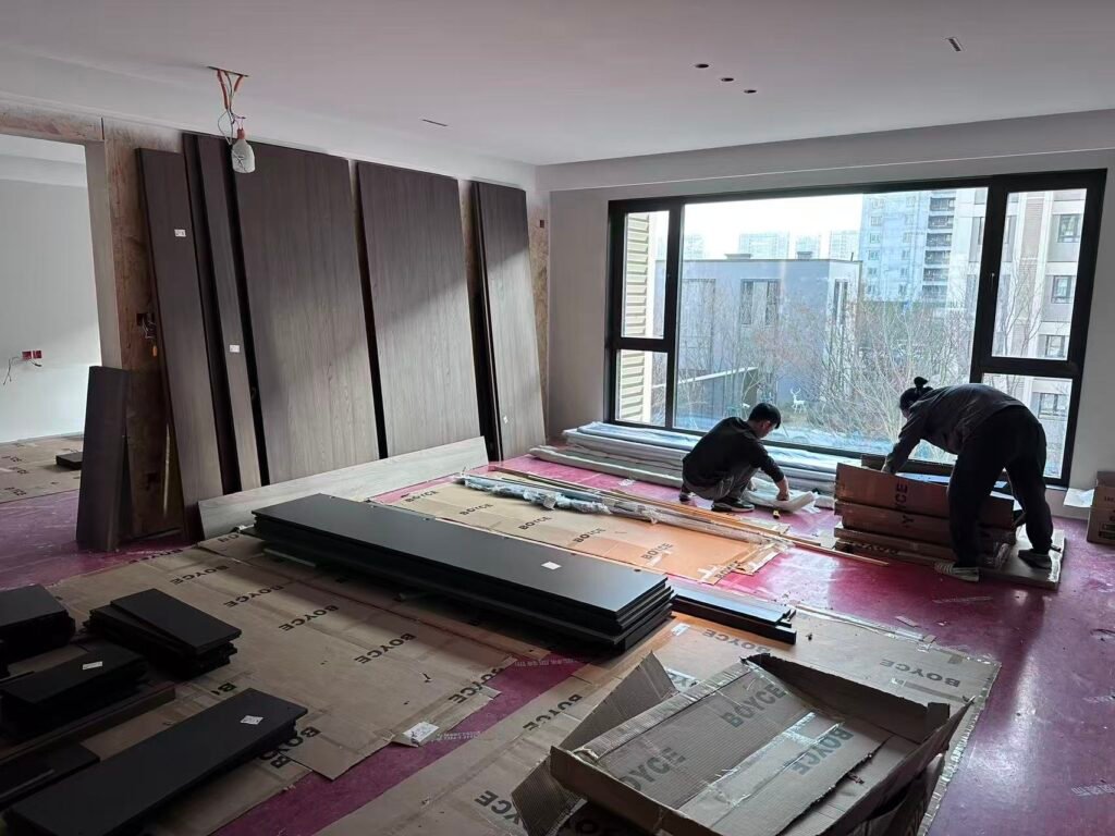
Turnkey Project Installation Site
  • Lacquer and painted finishes — should be matched against a fixed, retained master sample for every production run, not re-mixed by eye each batch.
  • Natural wood veneer — grain and tone vary piece to piece by nature; project specifications should define an acceptable tone range rather than expecting identical matching, and flag which units are most visible together (adjoining rooms, shared corridors) where mismatch would be most noticeable.

Choosing a Palette That Scales, Not Just One That Photographs Well

For a multi-unit project, the practical goal is a small, defensible palette — two or three combinations that cover different room sizes and light conditions — rather than a different creative pairing per room. This keeps procurement simpler, keeps finish batches easier to control, and keeps the guest experience consistent from one room to the next, which research on hotel interiors consistently identifies as more valuable at scale than novelty.

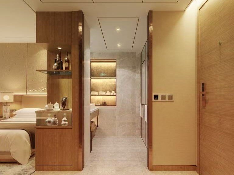
Bespoke hotel room furnishings entrance area

Sourcing Consistent Wardrobe Color Across a Multi-Unit Project

At BoyceCasa, wardrobe color and finish combinations are approved against a retained master sample and verified under the project’s actual specified lighting temperature before production begins, so what installs in guest room one matches guest room one hundred — not just in the showroom, but under the light guests actually see it in. This same consistency extends across our kitchen cabinets and interior doors lines, keeping color and finish specification uniform across a project.


FAQS

What are the most popular wardrobe color combinations for modern bedrooms?

White with warm wood, black with warm wood, two-tone panels, grey with white, and mirror panels paired with wood are among the most consistently popular combinations, each suited to different room sizes and lighting conditions.

Yes, significantly. Warm light (2700–3000K) enriches wood tones but mutes blues and whites, while neutral-to-cool light (4000–5000K) renders whites and greys more accurately but can make warm wood tones look flatter. The same finish can look noticeably different depending on the installed lighting temperature.

Generally not as a default. Dark finishes read as visually heavy in smaller or dimly lit rooms, whereas lighter tones or mirror panels tend to make compact bedrooms feel more open.

Lacquer and painted finishes should be matched against a fixed, retained master sample for every production batch, while natural wood veneer should have a defined acceptable tone range rather than an expectation of identical matching, since veneer grain naturally varies.

Not usually recommended at scale. A small, defensible palette of two or three combinations matched to different room sizes and light conditions is generally easier to source consistently and delivers a more coherent guest experience than a unique combination per room.

Explore our Kitchen Cabinets and Wardrobe collections to see factory-direct cabinetry for villa and hotel projects, or contact our team for a project-specific consultation and quote.
Related reading:
White Lacquer Glass Texture Kitchen Cabinets: Design, Materials & Sourcing Guide
White Oak Kitchen Cabinets: Durability, Cost & Sourcing Guide
Turnkey Interior Solutions: The Complete Guide for Property Projects

Let’s Discuss, Your Project.

Tell us about your project requirements and we’ll connect you with the right team. We typically respond within 24 hours on business days.

Call / WhatsApp
Offices
Located on Central Avenue, Nanhai District, Foshan City, Guangdong Province

Start a Conversation

Fill in your details and we’ll be in touch shortly.


Scroll to Top